Week1 Design Analysis
I recently discovered this book in a deep corner of my bookshelf. It got a very intense cover which matches the content pretty well. Here is what I thought.
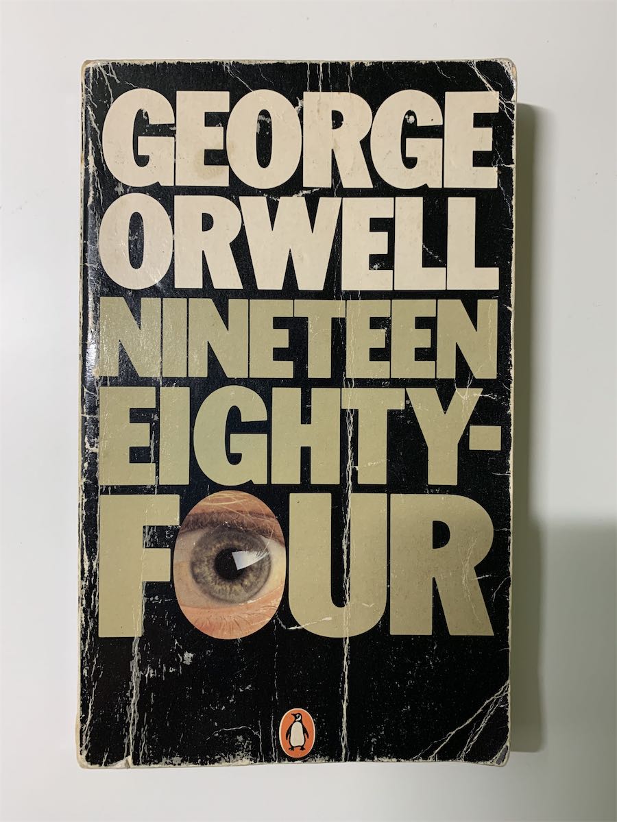
1984 Book Cover Analysis
This book cover is very simple, it only includes the title, author, a small icon of the manufacture, and no more. The title also contains a picture of an eye representing the letter ‘o’.
Grid system
There are many invisible horizontal parallel lines dividing the vertical space into pieces. The lower parts are bigger than the upper parts. It makes the whole design more stable.
Hierarchy of elements
The title has the biggest font and take most of the space since it is the most important element. The manufacture’s icon is much smaller than any other elements because it is the least important. The eye’s picture in the word stands out well. It’s the key to the book - ‘The big brother is watching you’
Typography
There is only one font appears in this design - Franklin. it’s the condensed version and extremely bold.
Color system

Mostly low saturation colors with a tiny bit of bright orange.
Negative space
There is not much blank space in this design, which I believe was intentional. It creates a breathless atmosphere just like the book.